Tired of doing real math 1 - some visualizations of Hillary Clinton and Donald Trump tweets

As a grad student working primarily on statistical methodology, I regularly experience phases of total disillusionment with math/stats. Recently I realized that when I don’t feel like doing “real” math for prolonged periods of time, I instead can work on data analyses, which are mathematically unsophisticated (and possibly of low mathematical quality), but rather focus on simple techniques and/or visualizations of interesting data. Somebody at kaggle.com conveniently provides tweet data of this year’s two major presidential candidates. Here, I very briefly visually investigate this dataset.


Code
- I have uploaded a script producing very similar word clouds as the above ones to kaggle.com. Arguably a word cloud is far from being a good statistical tool, but it’s fun. Besides, it gave me an opportunity to improve my regex skills, and to learn about palettes and fonts in R (http://colorbrewer2.org is awesome!).
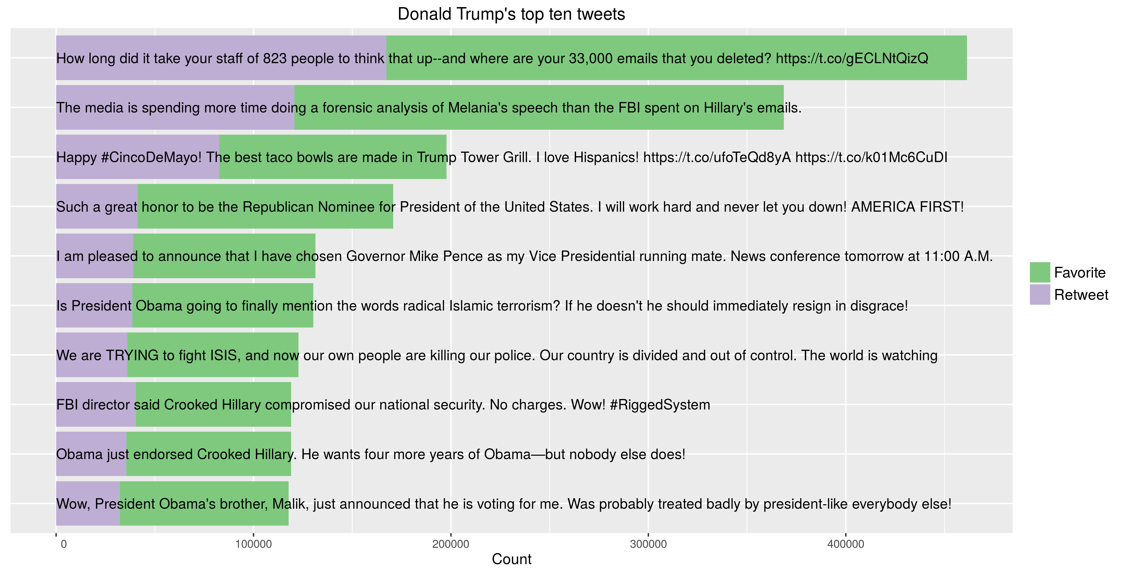
- I have also written a script producing the above visualizations of the top ten tweets of either presidential candidate, learning more about ggplot2 in the process.